
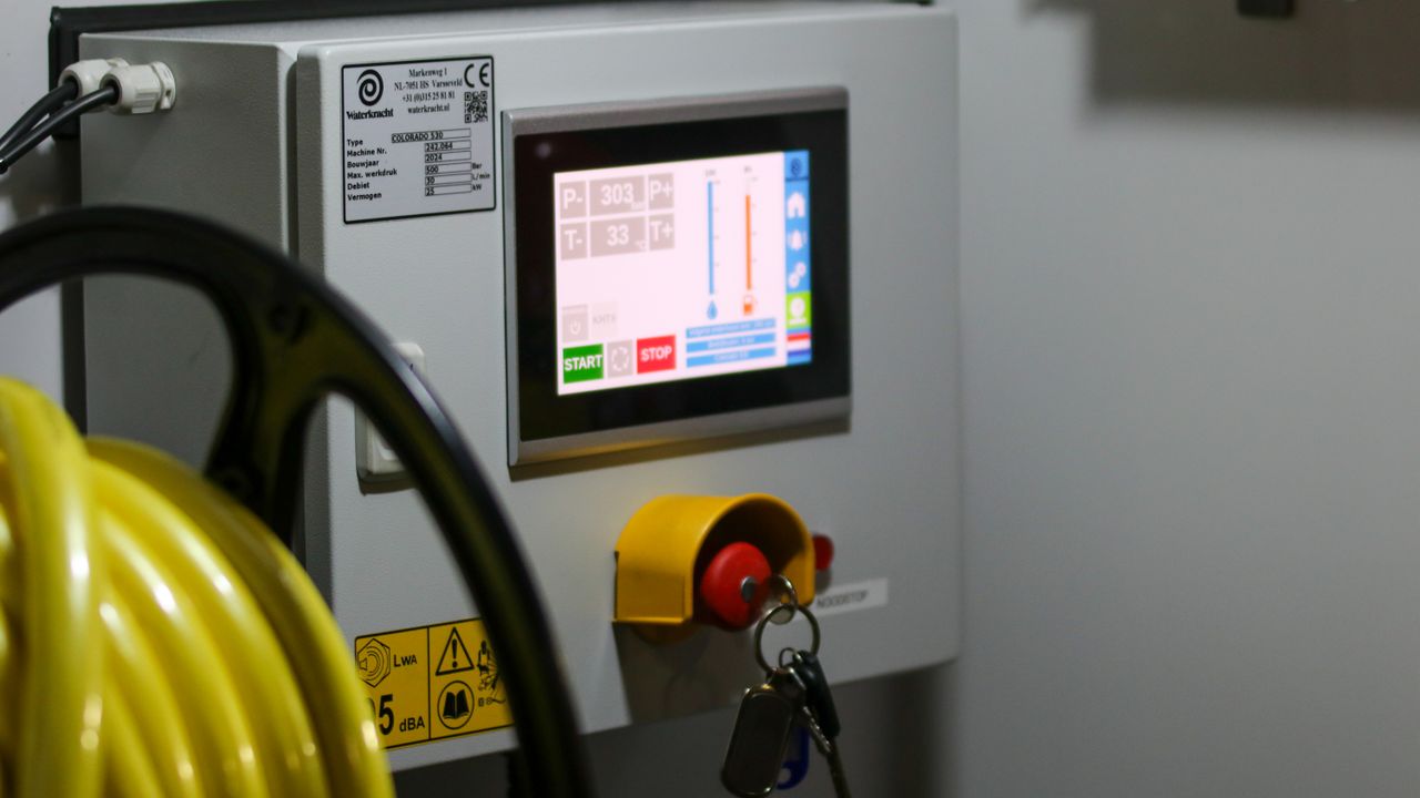
You sized the cabinet, you picked the CPU, and now someone on the team asks whether the panel should be 7-inch or 10.1-inch. Either can work. The decision usually hinges on five things: how much information must fit on screen, how far the operator stands from the panel, how big the cutout in the steel can be, what your software budget looks like, and how fast you need it shipped. This guide is the shortcut.
What you actually get from the extra 3.1 inches
The difference in diagonal is roughly 45 percent, but the usable area on a 10.1-inch widescreen (1280×800 or 1920×1200) is closer to 2.3× the area of a 7-inch panel (typically 1024×600). That ratio matters more than the diagonal because it tells you how many gauges, lists or buttons you can fit before things start to crowd.
Concretely:
- 7-inch at 1024×600: two process values, one trend chart, and a row of soft keys, or a 6×3 numeric keypad with a small status area.
- 10.1-inch at 1280×800: a full dashboard with 4–6 process values, a real-time trend, an alarm summary panel, and navigation, all visible at once.
- 10.1-inch at 1920×1200: same layout, sharper text — useful when operators are 60+ cm from the screen or when label text is bilingual.
Viewing distance and ergonomics
For an operator working at arm's length — keypad entries, barcode scans, quick parameter tweaks — 7-inch is fine. The touch targets are still comfortable, the panel doesn't dominate the workstation, and your eyes don't need to refocus between screen and the workpiece.
When the screen sits across the equipment (1 m or more) or when a supervisor needs to glance at status without walking up, 10.1-inch earns its space. Smaller text remains legible, charts show more history, and a wider viewing angle means off-center operators still read the screen correctly.
One number worth checking: at 60 cm viewing distance, a 7-inch screen in landscape has roughly 30 percent less vertical real estate than a 10.1-inch. If your UI relies on stacked rows — alarm logs, recipe steps, batch records — that gap shows up immediately in usability tests.
Cutout size and panel depth
Mechanical drawings sometimes get approved before the electrical schematic, so the cutout constrains the choice more than people expect.
| Size | Typical cutout (W×H, mm) | Typical panel depth |
|---|---|---|
| 7-inch | ≈ 175 × 130 | ≈ 30–40 mm behind bezel |
| 10.1-inch | ≈ 245 × 165 | ≈ 32–42 mm behind bezel |
The depth difference is small because the LCD stack scales gently. The cutout step from 7-inch to 10.1-inch is about 70 mm wider and 35 mm taller. If your existing cabinet was laid out for a 4.3 or 5-inch panel, both 7 and 10.1 will require rework.
On AOYU panels, all our 7-inch and 10.1-inch P, M and G panels ship with matching .igs (3D) and .dwg (machinery) drawings — your mechanical team can lock the cutout into the BOM before the first samples arrive. See for example the P S1 7" Touch Panel PC drawing pack.
UI density and software cost
On a 7-inch screen you typically commit to one of two layouts: either a tabbed interface that hides complexity behind pages, or a stripped-down dashboard with two or three widgets. Both are workable. The trade-off is software — more pages, more state, more testing.
On 10.1-inch you usually keep a single, richer screen. That often means less navigation code, fewer transitions to test, and a shorter validation cycle. For OEM teams reusing the same UI across product variants, the 10.1-inch layout often ports more cleanly.
This is one area where the "bigger screen costs more" argument flips: a slightly more expensive panel with one screen instead of four pages can shorten the project by weeks.
Cost, lead time, and what to actually compare
Per-unit panel pricing differs by series and CPU option, not strictly by size. Our 7-inch and 10.1-inch panels across the P, M and G lines use the same RK3568, RK3288 and A133P compute options, so the size delta on the BOM is usually modest. Lead time is the same — both sizes share the production line.
What changes the total cost more than the panel price:
- Tooling changes for the cutout (a new steel cut is more expensive than the panel itself).
- Software effort for a denser UI.
- Validation time on the larger UI.
For prototyping, ordering both sizes for bench testing is normal. A 10.1-inch sample alongside a 7-inch one gives you a side-by-side UX comparison before you commit the cabinet drawing.
Which to pick, by project type
Pick 7-inch when:
- The operator works within arm's length.
- The screen shows a few values, a keypad or a simple recipe list.
- The cabinet was designed for a smaller panel — 4.3" or 5" — and you can't rework the cutout.
- Cost and weight are tighter constraints than information density.
Examples: access control keypads, food equipment HMIs, vending interfaces, small-format PLC operator panels. In our lineup the M S1 7" Touch Panel PC targets this class with the A133P platform for lean I/O monitoring.
Pick 10.1-inch when:
- The panel sits a meter or more from the operator, or multiple people read the screen at once.
- The UI has dashboards with several values, real-time trends, and an alarm or recipe view.
- The mechanical enclosure is purpose-built and the cutout can be sized for 10.1".
- The UI is reused across products and you want one layout, not five paged ones.
Examples: CNC consoles, machine tool operator panels, building automation dashboards, energy monitoring stations. The G S1 10.1" Touch Panel PC pairs the 10.1-inch widescreen with an aluminum CNC frame and front-embedded mounting — common pick for industrial control cabinets — and runs the same RK3568 compute as the 7-inch siblings.
If you want commercial-grade interactivity on a 10.1-inch, the P S1 10.1" Touch Panel PC adds the interactive P Series stack (multi-touch, optional CAN, broader OS support including OpenHarmony and UnionTech UOS).
Common pitfalls
- Picking 10.1-inch for "future-proofing" without a layout that uses the space — large screens with sparse UIs look unfinished and waste BOM.
- Picking 7-inch for a console that will later need a trend chart or alarm list — these almost always grow into the 10.1-inch layout anyway.
- Specifying a size by diagonal alone when the cutout differs from what the cabinet can accept. Always check W×H, not the inch.
- Forgetting the OS and runtime impact: a denser UI on 10.1-inch is still rendered by the same RK3568 or A133P. Frame budgets shift, not the silicon.
Quick decision flow
- If the cabinet cutout is fixed and measures under ~180 mm wide, stay with 7-inch.
- If the operator is across the room (≥ 1 m), default to 10.1-inch.
- If the UI needs four or more simultaneous widgets, default to 10.1-inch.
- Otherwise, prototype both. The sample cost is small relative to a recall or a layout rebuild.
We size 7-inch and 10.1-inch into HMI projects every week across the P, M and G series. Send us your project brief — cabinet cutout, UI mockup, and expected volume — and we will come back with a panel recommendation and a quote within one business day.
Ready to start your HMI project?
Our engineers help you choose the right HMI hardware and software for your project.